Digital Design


Low-Poly Self Portrait
Isometric Environment
This is a self portrait of myself. It was one of my first projects using Adobe Illustrator. We were only allowed to use the pen tool and to only draw triangles. We had to make sure the colors were right, and that certain textures were made to depict what they represent.
This is an isometric environment of my studio room at my house. We had to take in consideration of angles, placement, and color. We also got the chance to use opacity, and figure out how to depict light using an isometric environment.

Produce Stickers
We had to come up with a produce sticker design and had to figure out scale for the first time. This was a challenge since I never worked in a small space like this. We had to take in consideration about how it can be read, organization, the typography, color, and size of the typefaces.
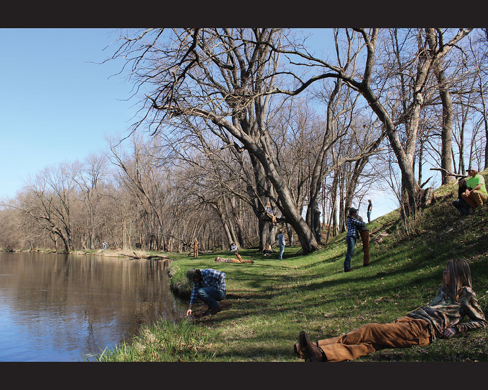
Manufactured Landscape
Jeff Wall: Manufactured landscape is a project in which we had to take inspiration from a photographer, and recreate their style, but not replicate it. This project challenged us to use Photoshop, DSLR cameras and figure out green screens. This took a lot of time and effort and is one of my favorite pieces I have designed and created. I had asked my friends to model for this, and asked them to do random things in relation to this environment. It is more of collaborative project, and allowed for creative freedom within the models. This piece was also accepted in the University of Wisconsin Eau Claires 68th Juried Student Art Show.

Calder Poster
This project required to think about typography, and what it can say, without any uses of images. We had to figure out how to create intersections to create visual interests, along with how to relay the message about Alexander Calder's work.

Stamp Redesign
This was another project we had to consider scale, and readability, but also theme as well. We had to come up with a deviation of a branding style, and make it about something we are interested it. This piece is inspired by my Mom because she loved the topic of spirituality, along with constellations and story telling.


Box Bee 3D Logo
Foldable Promotion
This is a logo developed for a fictional company, "Box Bee." This company is imagined to sell bee supplies, like honey bee hives or bee boxes. We had to come up with a logo, but reimagine it in a 3D space. We had to take in consideration scale, space, visual interest and how to make it feel completed with textures and patterns. This logo was laser cut with plexiglass. All of the hardware was bought from Menards. This is meant to be a hanging sign for the business, and can be viewed from both sides.
This is a promotion for Heat Blossom Designs Quilt Shop's open sew day. This is a day where anyone is invited to sew and chat together.. This flyer is meant to be interactive for the viewer, and is meant for an easier delivery to the viewer in a more organized and visually interesting way.. This is an accordion fold, creating multiple sections that are easier to read, but also relate to quilting as it adds a geometric aesthetic.. Font size was also in consideration as this event appeals to older folks.
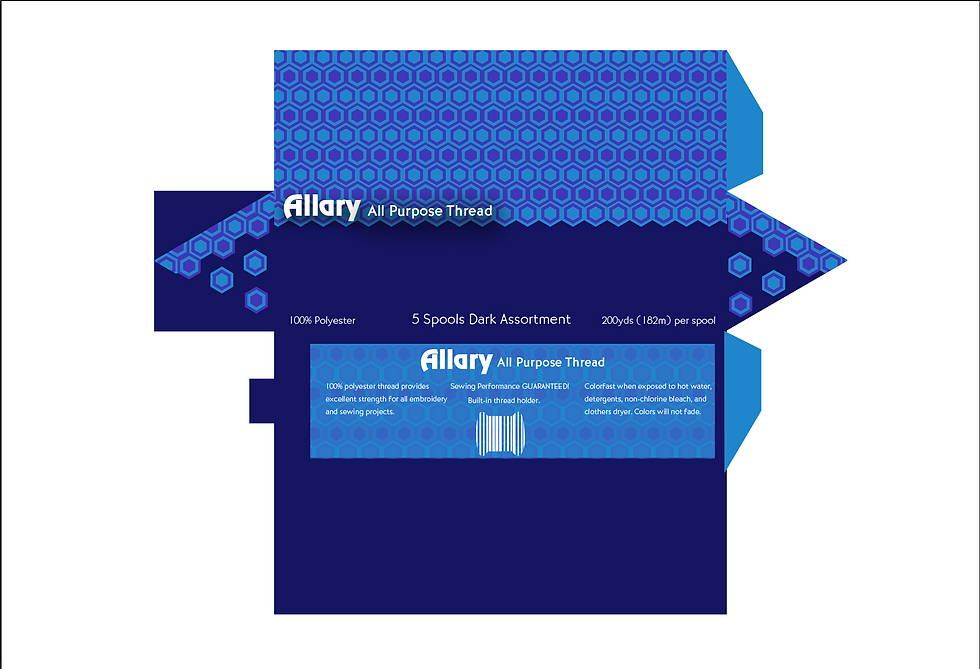


Thread Display
This thread display was for a sustainable packaging project, meaning only paper is to be used to make a new design for an item that uses plastic packaging. I decided on thread because it comes in a plastic zip lock bag, which was hard to put the thread back in, and was of bad quality. The goal of this redesign is to make it more pleasing to look at, but also add function to the packaging. This display also serves as a thread holder and dispenser so it isn't of great mess, and doest create disorganization. This project made me think more of functionality of my designs and how it can add to the aesthetics in the viewers eye.

Blammo Redesign
This was my first packaging design. I had to take an outdated design that wasn't functional or appealing in today's society. Certain elements had to be considered to make it more believable. I also had to consider branding colors, font and typography. I also had to create nutrional facts, and ingredients sections to make it a lot more believable if it were to come back in todays society I really enjoyed the colors, bubbles, and font choices for this project, as they can relate back to each other and their functionality.
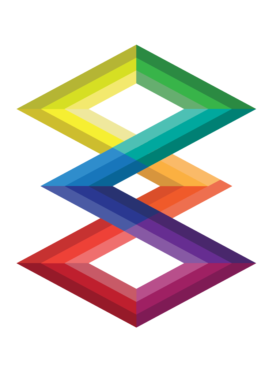
Color Wheel Redesign
This was a part of a 2 part project where we had to mix the colors for the color wheel, but also reinvent the color wheel so then it still has its functions. For example, being able to determine completmentary, secondary and tertiary colors. I thought this was a great design because it isn't in a circle, but rather as geometric. It is also functional and visually appealing.